Start: March 2017. Some Climate Comments in English by a Skeptic …
Author: francozavatti
I'm a retired astronomer and lecturer at Bologna University (former Department of Astronomy, actually Department of Physics and Astronomy). After retirement I changed my interest to Climate Science. I cannot understand as a plain-brain people can accept the narrative of the Anthropogenic Climate Change without any doubt.
So, I located myself in the field of the climate skeptics.
After 6 years from the retirement, with Luigi Mariani I published two peer-review papers concerning Climatology.
Actually (February 14, 2023) I've published 229 articles on the web, mainly at http://www.climatemonitor.it/ and at my own site
https://www.zafzaf.it/clima/indice.html (the PPxx.html files)
Here as United States I intend the contiguous US and use the NOAA dataset that annotates the percent area of the US invested by very warm and very cold events, from January 1895 through July 2019. The plot in figure 1 shows that the warm events are concerned with wider and wider areas and the cold events smaller and smaller areas. As it can be seen, in both cases there is a large variability, so I refer to the average behaviour derived by the linear fits.
Fig.1: The percent area of the US interested by very warm (red) and very cold (blue, sign reversed) events. The linear fits show a rise (slope circa 0.12% per year) for the warm events and a similar decrease for the cold ones.
All the events concerning this post are “extreme” (ie very warm and very cold) but I prefer to extract from the dataset a subset of “most extreme” events which contains only the areas wider than 40% of the US territory.
The data, displayed in figure 2, clearly shows that the areas interested by warm events are wider tan those by cold events.
Fig.2: The time series of the areas wider than 40%. As in fiigure 1 the cold events have the value of percent area with reversed sign.
From the above data I extracted the decadal frequency for both warm and cold events and show the relative histograms in the next figure 3.
Fig.3:
The histograms of the very-very warm and very-very cold, defined as those concerning areas greater than 40%. I don’t show the last bin because of its incomplete interval (2015-2024); its value is actually 15, the same of the preceeding bin.
The situation looks like the CEI index (extreme events in the US, see eg this post, in italian) that begins to rise from 1965 through today while, before this date, it shows a decrease (the cold activity has always decreased).
In front of that, however, the CO2 concentration has always monothonically grown in such a way that it is difficult to associate extreme events to a growing CO2.
All plots and data about this post are available at the post’s support site: here
Franco Zavatti August 6, 2019. Updated August 6, 2019
In Caillouet et al., 2019 a software (SCOPE) is presented which can reproduce high resolution meteorological data. In their figures 5 and 6
precipitation and temperature at the Lyon-Bron airport (France) have been presented as an example of the ability to generate a dataset, also in comparison with the observed data. They made available only plots of reconstructed precipitation and temperature in the range 1870-2010, so I discretized such plots and obtained, for precipitation, the series lione1.txt available in the support site and plotted in the following figure 1.
Fig.1: 1870-2010 precipitation at Lyon-Bron airport. Also average value (red), slope of linear fit (orange) and 10-yr low-pass filter (purple) are shown. Please note as the (only two) maxima are at 1.5 times the average, to be compared to the two-fold-the-average maxima in Spain. The lowest minima (4 or 5) are only 25% of the average value.
So, I cannot see any increasing number of extreme events; on the contrary, it seems strong rain events disappear after ca 1980. Also the lowest values on the record (4 or 5 in total) have levels of about 25% of the average value. From the overall slope it can be derived rain is decreasing along the time range considered here, at the rate of (8±2) mm per decade.
Temperature
As in the case of precipitation, I have discretized the “median” data of the “annual” plot in Caillouet’s figure 6 and show it in figure 2
Fig.2: Annual temperature at Lyon-Bron airport. Also average value (red), slope of linear fit (orange) and 10-yr low-pass filter (purple) are shown.
The temperature at the Lyon-Bron airport approximatively follows the global land temperature. If a ΔT can be derived from the low-pass filtered data, then it is less than 0.8 °C; the highest picks are some tenth of degree above the average (filtered) curve; so they cannot be defined “extreme events” and, by the way, their number is really low. Increase in intensity or frequency of so called “heat waves” cannot be inferred from the Lyon data of temperature.
The temperature dataset displays an up and down behaviour in front of a continuously rising CO2 concentration, the same of some datasets of global land+ocean temperature (see e.g. here, in italian).
All plots and data concernig this post are available in the support site at the author’s web server, here (gray background)
References
Laurie Caillouet, Jean-Philippe Vidal, Eric Sauquet, Benjamin Graff, and Jean-Michel Soubeyroux: SCOPE Climate: a 142-year daily high-resolution ensemble meteorological reconstruction dataset over France., Earth Syst. Sci. Data, 11, 241-260, 2019. https://doi.org/10.5194/essd-11-241-2019
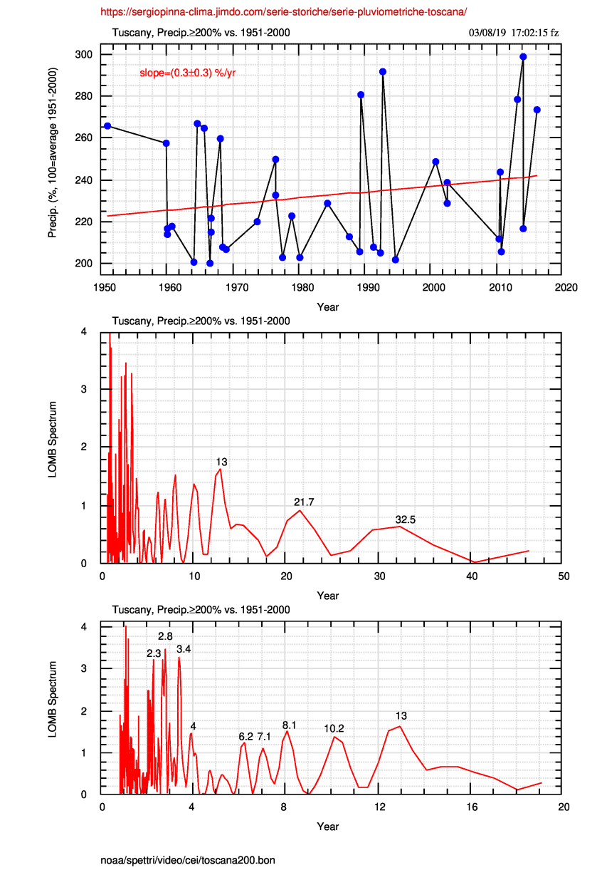
In prof. Sergio Pinna’s web site here (in italian), monthly total precipitation in Tuscany, 1951-2017, are available in the form of percent of the average values of the 1951-2000 baseline as it appears in figure 1.
Fig.1: 1951-2017 precipitation in Tuscany as percent of the average values 1951-2000 (click to enlarge).
In this post I’m interested to show if strong rain events are visibile in the above data, so I extracted all the “extreme” monthly cumulated gauges from the 67-year dataset: of course I need a definition of what is an “extreme” event and choose all the events that have a percent greater or equal to 200. My extremes are then the ones where the rain is at least two times the average 1951-2000 value.
These values are available as toscana200.txt at the support site.
Fig.2: Precipitation greater than or equal to 200% (i.e. the double of the average value, at least). The red line is the linear fit that roughly correspond to some 20% in 66 years (or a 0.3%/yr rise). The Lomb spectrum shows the same maxima as the USA CEI and other climate series (click to enlarge).
The extreme events are widely disperse and, on average, show a positive slope of (0.3±0.3) %/yr, not so much significative.
In the Lomb spectrum the same spectral maxima as in USA CEI index or in Garda Lake level are present, mainly the 2-8 and ~12-20 years range.
The next step has been the binning of the data in both 10 and 5 years bin width. The binned values can be read here while the histograms are in the following figure 3
Fig.3: Histograms of the number of extreme (≥200%) precipitation in 10-yr (top) and 5-yr (bottom) bins. The red line is the linear fit whose slope is labeled (also in red). The digits within the bins are the start and the end year of the bin (click to enlarge).
What clearly appears from figure 3 is the negative slope of the linear fit of the data or, in any case, not a rise in the last 67 years.
Again, if we use data they give a different information from the AGW narrative of a catastrophic evolution of climate, and that happens at several scales (small region as in the present case; continental as for cyclones and tornadoes or a wider region as in extreme events in Spain).
All plots and data concerning this post are available in the support site at the author’s web server here
Franco Zavatti July 30,2019; Updated: August 6,2019
In October 2018 Meseguer Ruiz and collegues published the paper in spanish Episodos de precipitaciòn torrencial en el Este y Sureste Ibéricos y su relaciòn con la variabilidad intraannual de la oscillaciòn del Mediterràneo Occidental (WeMO) entre 1950 y 2016 (full text available at https://www.researchgate.net/publication/334329930) where 239 episodes of torrential rainfall (>200 mm/24 hours),registered in the Júcar and Segura rivers hydrografphic basins, were analysed, after a binning over 10-days intervals, along with the Western Mediterranean Oscillation Index (WeMOi) binned the same way, in the aim to look for a correlation between such a series.
Abstract
The relationship of the Western Mediterranean Oscillation (WeMO) with the intensity of precipitation in the Mediterranean coast of the Iberian Peninsula has been demonstrated in several works. Between 1950 and 2016, 239 episodes of extreme torrential rainfall mm/24 hours) were registered in the Júcar and Segura hydrographic basins (3.6 cases per year). The 29.3% of these events took place with a highly negative WeMO phase, the 37.5% of the cases in a negative phase, and the 28.3% of the cases in a lightly negative phase. Only the 7.9% of the events occurred in a WeMO positive phase. A change on the calendar of the minimum values of the WeMO was identified, happening now in the last weeks of August and beginning of November instead of in the first weeks of October. This extended period might be related to a new temporal distribution of the extremely torrential events of precipitation. The WeMO is shown as a good indicator to analyse the torrential precipitation events in the east of the Iberian Peninsula.
Fig.1:The 10-days binned extreme rain events here plotted as 3-bin low-pass filtered data. The labels on the left indicates the time range of any plot. The abscissa is in 10-days units and the month is also indicated in red.
I will discuss such a correlation at the end of the post but now I prefer to produce their data (available within the paper) in a slightly different way from the authors: they compare the histograms of rain events (1950-2016) and (1950-1982)+(1983-2016) to the corresponding WeMoi index.
My figure 1 shows in a unique frame only the rain events in all the available ranges (because my aim is different from the authors’ one), so I can note that the larger number of torrential rain events belong to the 1950-1982 time interval while the peak value of the 1983-2016 period is at about half-way of the former one. That means the extreme events doesn’t depend on temperature (or its supposed driver, carbon dioxide).
The next figure repeats in the upper panel the above figure 1 and the bottom panel reflects the WeMO Index (again, 10-days binned and 3-bin smoothed).
While it clearly appears an inverse general correlation between large number of extreme events and low WeMOi values, I must outline that WeMOi on the entire range (cyan line) places itself in the middle of the other two graphs in such a way that the higher number of events doesn’t correspond to the lower value of the WeMO Index. I’m not sure we can speak “sic et simpliciter” (i.e.simply) of “correlation” between rain and index and I think their connection may be more complex.
But that is outside the scope of this post.
Fig.2: As figure 1 with added the 10-day binned WeMO Index. Please note the general (anti-) correlation between high number of events and low values of the index, but also the non-correlation among the number of events and the value of index.
All plots and data concernig this post are available in the support site at the author’s web server here
References
Óliver MESEGUER-RUIZ, Joan Albert LOPEZ-BUSTINS, Laia ARBIOL ROCA, Javier MARTIN-VIDE, Javier MIRÓ, María José ESTRELA: Episodos de precipitaciòn torrencial en el Este y Sureste Ibéricos y su relaciòn con la variabilidad intraannual de la oscillaciòn del Mediterràneo Occidental (WeMO) entre 1950 y 2016. https://www.researchgate.net/publication/334329930
Franco Zavatti June 14, 2019. Last Update: June 15, 2019
Tornadoes, strong events due to the contrast of cold and warm air have been recently put into the press “radar”, due to a sequence in Ohio, Kansas and other american states (see e.g. this article by Microsoft News“). As usually belongs to these strange periods, the Anthropogenic Global Warming (AGW, actually re-defined as Climatic Crisis) has been associated to such events also if the MIT expert scientist Kerry A. Emanuel says that “it is absolutely complicated” to links tornadoes and AGW. In practice, there are no elements in the data allowing the association between frequency of occurrence and AGW.
It must be remembered that a 2014 paper from Science (Brooks et al., 2014) is also quoted, where, in its title, a reference to an augmented variability in the occurrence of tornadoes is made (not of their frequency).
The rise of the events in May 2019 (but tornadoes are also present in november-december) has been analysed by Dr. Roy Spencer on his blog, where he gives a meteorological expanation for them (i.e. The Northern American Plains, this year, have been “the coldest place on Hearth”) and shows the histogram of the distribution of F3, F4, F5 tornadoes from 1954 through 2018 (data from NOAA).
For sake of comparison I downloaded the tornado data from the Storm Prediction Center NOAA site, 1950 througth August 2018 (here used only up to 2017, the last complete year on this site), selected the “violent” F3, F4 and F5 events and plotted in figure 1 the histogram of the number of events for the single categories and for their sum. Fig.1: Histograms of the tornado frequency: in the upper frame F3, F4, F5 events and their sum (All). in the lower frame only the F4 and F5 tornadoes. The regression lines of the single distributions are also plotted.
It clearly appears that the slopes are in all case less than zero, so tornado average frequency in the last 67 years is decreasing. Numerical values of the linear fits are available in this image or in the numerical file .
The number of 2018 tornadoes seems to be the lowest in the history and all the “violent” event in this year are F3; such a value and a possible positive fluctuation in 2019 would belong to the normal variations, well visible in figure 1, and so as usual, “nothing new under the Sun” and a large waste of ink (both virtual and real) in the pain cries of catastrophists.
Connection AMO – Tornado frequency
The frequency of the tornadoes is generally linked to the Atlantic Multidecadal Oscillation (AMO) because of its influence on the continental climate (and weather). Connection should be inverse, in the sense that when AMO is negative the tornado frequency rise. A verification has shown in figure 2, where the AMO series is reversed (times -1) so that a positive correlation can be outlined.
Fig.2: Relation between AMO (times -1) and tornado frequency. The series smoothed over a 11-yr window and, in the lower frame, the Cross-Correlation Function (CCF) of the observed and smoothed data. It can be seen the smoothing distorts the CCF . CCF(0) is the lag 0 correlation or the Pearson correlation coefficient. Tornado data have been divided by 200 so the values are comparable to the AMO ones.
CCF between AMO and tornado frequency shows an interesting value of about 0.55, not so high but able to highlight a possible relation. Plot of AMO monthly means (1856-2017) and their spectrum is available here.
Tornado frequency Spectrum
Time extension of tornado series is 67 years, so the AMO main period (about 72 years) will not expected in their spectra and really in figure 3 we do not see a spectral maximum around 60-70 years; only a faint hint of a 55-year maximum in the F3 spectrum that reflects a similar behaviour in “All” series. Fig.3: MEM spectrum of the four series in figure 1 (the same colors are used). Spectral maximum at about 9 years is the same of the AMO (the stronger one, after the main 72-year maximum) while in the last spectrum the 4.2 year maximum – the main one in F3 and All series – does not exists.
In F4 and F5 spectra a 19 and 18 years maximum appears, respectively. It does not exist in F3 spectrum where it seems to be moved to about 13 years. In summary, the tornado frequency looks like to be linked to El Niño (3-6.5-7.5 yr), to Sun-planets (18-20 yr) and, at some degree of uncertainty, to AMO (9 yr) due, the last one, to the limited time extension of the series less than the main period of the Atlantic Oscillation.
References: Harold E. Brooks, Gregory W. Carbin, Patrick T. Marsh, Increased variability of tornado occurrence in the United States,Science, 346, 6207, 2014. http://dx.doi.org/10.1126/science.1257460
All plots and data relative to the present post can be found in the support site here
Franco Zavatti May 20, 2019; Last Update: August 21, 2019
Abstract: The combined fits of the temperature series through 800 CE describes sufficiently well also the data of the Shihua Cave stalagmite, extended through 650 BCE. The whole set of temperature series used here is presented along with the final comments.
Riassunto: I fit combinati delle temperature fino all’800 CE è in grado di descrivere
ragionevolmente bene anche le temperature della stalagmite della grotta di Shihua che si estendono fino al -650 CE. Viene presentato l’insieme delle serie di temperature usate nei due articoli insieme ai commenti conclusivi.
Shihua Cave (115°56’E, 39°47’N, 251 m asl at the entrance), about 50 km SW from downtown Beijing, within the East Asian monsoon zone, has been opened to visitors in 1986 and since then the internal CO2 level has risen from 500-600 to 1350-2000 ppmv and the cave temperature from 10.6~13.5 to 13.9~16.4°C.
These changes in cave conditions have resulted in a reduced rate of calcite precipitation, so stalagmite growth layers formed after 1985 cannot be used to reconstruct climate (Tan et al, 2003).
These authors produced a warm-season (MJJA) temperature series between 665 BCE and 1985 CE, derived from correlation of annual layers thickness variation for a Shihua Cave stalagmite and the meteorological data of the nearby zone. The series is presented in figure 1
Fig.1: Shihua Cave stalagmite data. Thick red line is a 20-yr low-pass filter while the black line is the linear fit showing a slope of about (1.9±0.2) 10-4 °C/yr. Bottom plots show the MEM spectrum and outline the dominance of multi-century periods with respect the
centennial ones that exist and probabily are the centennial-scale warming Tan et al, 2003 outline in their paper.
Two deep temperature decreases must be noted: that centered at about 800 CE, whose existence is faintly confirmed by the tree-rings series in figure 2, I cannot be able to assign to a particular event and the one between 1450 and 1750 which correspond to the Little Ice Age (LIA) clearly shown also in figure 2.
The deep minimum around 520 CE is common to both series, while the tree-rings minimum at ~620 CE is remotely confirmed in the stalagmite series.
Tan et al., 2003, beginning in the title of their paper (“Cyclic rapid warming on centennial-scale …”) outline the existence of centennial scale oscillations (warmings).
The spectra in figure 1 show, with a series of low-power spectral maxima, 50-170 yr periods which could be the object of the statement by Tan and colleagues. In the same time, It must be noted that the Shihua Cave spectrum is dominated by the peaks at 815, 342 and, fainter of about 9 and 4 times respectively, 482 years.
Fig.2: Tree ring series chin046 (China) of tibetan juniper from 450 to 2004 CE. Data from NOAA Paleo (accessed May 16, 2019).
Figure 3 shows extrapolation, trought the time extension of Shihua data, of
the f23 fit of the Colle Gnifetti data described in the 1.st part of this post.
As expected, the fit does not follow the peculiar shapes (deep minima) of the Shihua series but it is a reasonable representation of its average run.
Fig.3: All used datasets and their fits by non-linear functions. For the Shihua series (tamliu.txt, light green) a fit has not been computed and the extension of the Colle Gnifetti fit (red line) was used. From 1925 to 2200 the fit of NOAA monthly data have been plotted.
Mixing data at different resolution does rise the doubt to create a man-made “hockey stick”. In the aim to verify if that may be such a case, the f22 fit (4 sines + line), computed from NOAA monthly data, has been compared to NOAA annual data in figure 4, along with the 1-year (CET and Shihua) and 2-year (Colle Gnifetti) resolution series.
Fig.4: Enlargement of figure 3 between 1700 and 2200, with the NOAA annual series (orange crosses) in order to verify as the “monthly” fit acts with respect to the annual data.
In the next figure, an enlargement of figure 4 better shows the comparison between fit and annual data. Remember that, through 1925 the f23 fit of Colle Gnifetti has been used which hardly can fit the slightly different NOAA data.
Fig.5: Part of figure 4 and its enlargement. Through 1925, Colle Gnifetti data (red line) fit.
Concluding remarks
The couple of fit f22 and f23 can represent well enough observed data from -650 to 2018 CE, covering a 2668 years time extension. Extrapolating 3% away of the full range (through 2100 CE) does not appear a severe hazard. Accordigly, the “forecast” anomaly at 2100, above the pre-industrial period, will range between 1 and 2 °C, in a fully natural way, without any need of dedicated action.
All the data used here are anomalies whose value depends on the time base used in calculations. This is why the Shihua data have been subtracted by 0.5°C.
All plots and original and derived data are available at the support site here
References
Tan M, Liu T, Hou J, Qin X, Zhang H, Li T: Cyclic rapid warming on centennial-scale revealed by a 2650-year stalagmite record of warm season http://dx.doi.org/10.1029/2003GL017352 (full text)
Franco Zavatti May 8, 2019, Last Updated: August 21, 2019
Abstract The fit of the anomaly series well represents the CET (Central England Temperature) and the NOAA global series (land+ocean) over 480 years (1538-2018).
Also if the fit is not a (physical) model, it perhaps may be estrapolated for
further 82 years (through 2100). Such an extrapolation brings to a 1.8°C anomaly in 2100, namely all the forecast and the presage of the last COPs,from Paris(21) to Katowice(24), without any need of reduction of anthropogenic emissions.
Riassunto: Il fit delle temperature (anomalie) rappresenta bene la serie CET (Central England Temperature) e la serie NOAA su 480 anni (1538-2018). Pur non essendo un modello, questo fit a due componenti può forse essere estrapolato di 82 anni (fino al 2100). Questa estrapolazione porta ad una anomalia prevista, rispetto al periodo pre-industriale fissato al 1850, di 1.8°C nel 2100, cioè tutta l’anomalia auspicata dalle ultime COP, da Parigi(21) a Katowice(24), senza bisogno di riduzioni di emissioni antropiche.
From figure 1 we can see the non-linear fit (four sines + line, 14 parameters, hereafter f22) does not differ so much from the semi-empirical armonic model by Scafetta (2013). Such a fit well represents (R2=0.804) observed data (“observed” is a not appropriate concept for values derived from many, and sometimes discussed, numerical procedures).
Fig.1: Comparison between the Scafetta’s model (2013, upper frame), sent to me by Nicola Scafetta, and the non-linear fit f22 (lower frame), both applied to the NOAA global anomaly (1118 refers to November 2018 series). The differences between the two frames appear to be minimal through the entire dataset extension.
The fit in the lower frame of figure 1 follows the data and nobody can say if such a function can represent an extension of the data. On the contrary, it is very probable that new (extended) data cannot be described by the (old) fitting parameters.
As an example, we make use of the CET (**, Central England Temperature, from 1538) series that, in their common part, is almost similar to the NOAA data. So, we can apply the result depicted in figure 1, but, moving backward, the old fit doesn’t work as it appears in figure 2.
Fig.2: Extension of f22 in both the time directions and superposition of CET data, in order to highlight as observations go away from an extended analytical function, as it occurs in the majority of cases for a fit, differently from what it should occur for a model.
Actually we must use another fitting procedure (hereafter f23, 6 sines + line, 20 parameters) in order to represent quite well the temperature anomaly during the LIA (Little Ice Age). The new fit (f23) has been computed from the 1538-1850 data and a connection to the previous fit (f22) takes place in 1850 as shown in figure 3 and in the enlargement of figure 4.
Fig.3: Combination of two non-linear fits in order to represent the CET (and NOAA) temperature anomaly between 1538 and 2018. The extension through the year 2100 (and 2200) is also shown.
The 1850 date is, with any evidence, an arbitrary choice: it has been selected on the basis of the start of the industrial revolution and on the synchronous end of the LIA, followed by the recovery of the climatic behaviours before the cold period, and so the beginning of a general warming. In opposition of this view, it has been tried to consider the LIA as a local or hemispheric climatic variation but traces of a temperature lowering have been observed also in New Zealand (Lorrey et al., 2013).
The connection, in 1850, between f23 and f22 is outlined in figure 4.
Fig.4: Enlargement of the connection point between f23 (on the left side) and f22 in the fit of CET data.
Colle Gnifetti series
Two ice cores (named KCI and KCC) from Colle Gnifetti, in the Monte Rosa complex (Alps, Italy-Swiss border), allow a further extension of the temperature (anomaly) dataset. The extension goes through 800 CE, in full Medieval Warm Period (MWP, 950-1250 CE). Numerical values are available at https://doi.org/10.1594/PANGAEA.883519.
Figure 5 shows the complete series of Colle Gnifetti, compared to the CET data, and its non linear fit f23 through 1925, followed by the old f22 fit (that of figure 1, lower frame) extended to 2200.
Fig.5: Temperature anomaly from the ice cores of Colle Gnifetti compared to the CET and to the fits f23 (800-1925 CE) and f22. In the year 1925 it takes place the connection between the two fits.
The figure 11 of Bohleber et al., 2018 (with its label) has been reproduced in figure 6; here calibrated temperatures, derived from the KCC core, are compared to instrumental and reconstructed (by Lutherbacher et al., 2016) temperatures.
Fig.6: Figure 11 from Bohleber et al., 2018 (MCA=MWP) and its label which writes: Figure 11: Comparison of decadal temperature trends as anomalies with respect to the mean of AD 2006–1860. Shown are calibrated temperatures obtained from the KCC Ca2+ variability (blue lines, with uncertainty indicated as light blue bands). Also shown are instrumental temperature data (black) and the summer temperature reconstruction of Luterbacher et al. (2016) in red (uncertainty as grey bands). Note that the overall co-variation between the two reconstructions persists for at least another 200 years beyond AD 1000 (light grey shaded area). Black bars on the bottom indicate maximum dating uncertainty.
Please note that here the abscissa has an inverted scale with respect to the other plots.
Final comments
What actually has been done has nothing to do with a physical model capable to reproduce (after understanding of both its causes and physical processes) long time-extension temperatures in different geographical regions;
It is a simple fit, i.e. a way to represent observed data by means of polynomials and sinusoidal functions and to compute the best-fitting parameters from the same data.
It is not the case to extend a fit result beyond the dataset because this operation can bring to unpleasant surprises. I’m conscious of this problem, unlike, e.g., Nerem et al., 2018. They, based on a 25-yr long (1993-2017) 2nd order fit of global sea level extend the result to the next 80 years (through 2100 CE).
But, also within the problems posed by such a kind of operation, perhaps it is possible to extrapolate the combined fit (f23+f22) in figure 3 of about 17% through 2100.
A slightly different result is obtained from figure 5 with respect to the one in figure 3, because the anomaly in 1850 (dependend from f23) has now a value of 0°C, so that the estimated temperature rise is only 1°C.
It must be stressed that the same extension, computed from the NOAA dataset, applies to two further (different, i.e. CET and Colle Gnifetti) series..
If we can agree with the above extrapolation, then the “model” depicted by figure 3 tells us the temperature anomaly will be (in 2100) 1.8°C over the pre-industrial level (1°C for figure 5), if such level will be fixed in 1850. The year 1850 is also the conventional date of the end of the LIA and the prosecution of the rise, started after the coldest LIA period, during the XVII century.
Also within the uncertainties of such a network, we can see that the target values, fixed by Paris COP21 (2°C or, better, 1.5°C over the pre-industrial level in 2100), appear as a natural evolution of the temperature, without any statement about the use (or not) of fossil fuel.
The need to change the fitting function after 1850, which is plainly layed to the beginning of the industrial era along with the consequent atmospheric immission of a growing amount of greenhouse gases and its associated warming, depends, in my opinion on the end of the Little Ice Age and on the next temperature recovery, after the (unknown) causes of the cold period disappeared.
All plots and original / derived data, concerning this post, are in the support site here
References
Bohleber P., Erhardt T., Spaulding N., Hoffmann H., FischerH. and Mayewski P.: Temperature and mineral dust variability recorded in two low-accumulation Alpine ice cores over the last millennium, Clim Past, 14(1), 21-37, 2018. https://doi.org/10.5194/cp-14-21-2018
Lorrey A., Fauchereau N., Stanton C., Chappell P., Phipps S., Mackintosh
A., Renwick J., Goodwin I., Fowler A.: The Little Ice Age climate of New Zealand reconstructed from Southern Alps cirque glaciers: a synoptic type approach, Climate Dynamics , July, 2013. doi:10.1007/s00382-013-1876-8. S.I.
Nerem R.S., Beckley B.D., Fasullo J.T., Hamlington B.D., Masters D., and Mitchum G.T.: Climate-change–driven accelerated sea-level rise detected in the altimeter era. PNAS published ahead of print, February 12, 2018. https://doi.org/10.1073/pnas.1717312115
Scafetta, N.: Discussion on climate oscillations: CMIP5 general circulation models versus a semi-empirical harmonic model based on astronomical cycles. Earth-Science Review , 126, 321-357, 2013. https://doi.org/10.1016/j.earscirev.2013.08.008
Abstract:Why am I a climatic sceptic? In the enclosed text (I’m a Climatic Sceptic. Yes, but why?) I list several issues who brought me to be a sceptic. The first issue is a criticism to the IPCC SR1.5 Report. My own list is outlined in a 42 pdf pages (in progress: the number of pages is growing) written in Italian. English version of this post follows.
Attorno a metà dicembre 2018 mi sono reso conto che non avevo mai fatto un “esame di coscienza” per capire quale erano le motivazioni del mio scetticismo climatico. Avevo tante informazioni e sensazioni che però non avevo mai organizzato e razionalizzato.
Ho quindi deciso di raccogliere per uso personale una serie di considerazioni che potessero giustificare il mio essere scettico nei confronti dell’ipotesi (teoria) del riscaldamento globale di origine antropica (alias cambiamento climatico) e ho scritto circa 30 pagine dal titolo Sono uno scettico climatico: Sì, ma perché? in cui, dopo una premessa che riguarda la mia definizione di scettico, ho riportato quasi integralmente alcune considerazioni, scritte insieme a Luigi Mariani e parzialmente pubblicate altrove, relative all’ultimo report dell’IPCC (SR1.5), seguite da una serie di punti di cui si discute nel dibattito climatico, corredate dalle mie considerazioni che ovviamente sono dettate dal mio modo di vedere il dibattito, dal mio carattere e dalla calma o dalla foga con cui affronto gli argomenti (questi particolari argomenti).
Quella che mostro è quindi (e non può essere altrimenti) una disamina di argomenti oggettivi che contengono i miei commenti che considero, anch’essi, oggettivi ma che possono facilmente essere visti come di parte, su cui si può benissimo non essere d’accordo, sia per gli argomenti che per il tono usato.
Ad esempio Luigi Mariani, la prima persona che ha letto una versione preliminare del testo, non è stato d’accordo con la mia impostazione: credo che l’abbia considerata troppo partigiana e poco scientifica. Avrei dovuto essere più “galileiano” e usare i dati e la scienza invece che affermazioni “talebane” e arrabbiate.
A mio parere la sua è una posizione accettabilissima e addirittura condivisibile e io, durante la mia vita lavorativa nel campo della ricerca astronomica e, nel corso di questi ultimi anni, nei post su CM e anche nelle due pubblicazioni scientifiche prodotte insieme all’amico Luigi, credo di aver dimostrato di poter e saper essere galileiano.
Anche Guido Guidi ha letto in anteprima una versione del testo e mi ha espresso la sua completa approvazione: certo, anche lui avrebbe potuto e voluto introdurre argomenti di tipo “filosofico”, forse simili a quelli di Luigi Mariani, ma ha preferito non intaccare quella che ha definito la mia “proprietà intellettuale”.
Il punto che ho cercato di portare avanti in questo testo è che, qui e adesso, è in atto una specie di guerra combattuta senza esclusione di colpi da persone che difendono una visione del mondo (e della scienza) che io non condivido e che voglio contrastare con tutte armi che possiedo (spero non con le menzogne che quotidianamente leggo e tutti noi leggiamo dal campo avverso).
Dicevo all’inizio che originariamente questo testo doveva servire solo a me; ho pensato però che, con tutti i suoi limiti e i suoi personalismi, avrebbe potuto essere utile ad altri lettori di CM in vari modi, dal rispondere alle critiche al costruirsi una propria visione dentro il dibattito climatico. Quindi lo rendo pubblico tramite il mio sito Word Press (su CM: http://www.climatemonitor.it/?p=50081, 15.1.19), sottolineando che ho cercato di usare il linguaggio più semplice che ho saputo trovare, anche se certi tecnicismi sono risultati inevitabili, nella speranza di essere utile.
È mia intenzione tenere aggiornato, per quanto possibile, questo testo. Quindi, ogni tanto, produrrò una versione nuova.
English version (Why I am a sceptic)
At about the middle of December 2018, I realized I never analysed the reasons of my being a Climatic Sceptic. My wide information and feeling never had been organized and made rational.
So, I decided to summarize, for my own use, some arguments which could justify my scepticism in face of the hypothesis (theory) of Anthropogenic Global Warming (AGW, aka, actually, Climate Change).
I wrote about 42 pages (in progress: the number of pages is growing) under the title: I am a Climatic Sceptic: yes, but why? (in Italian) where, after a premise with my own definition of “Sceptic”, I reported some issues (partly published elsewhere), written with Luigi Mariani, a friend I published two peer-review papers with, and relative to the last IPCC Report (SR1.5), followed by a series of arguments discussed within the climate debate. Such arguments are commented with my thoughts that of course follow my way to look at the debate and the calm or impetus I face while discuss those particular subjects.
I show here, therefore, an analysis of real (objective) subjects which contain my comments; the last ones are, in my opinion, objective too, but they can easily seen as partisan arguments and the reader can disagree with them, also because of the tone I use. For example, Luigi Mariani, the first one who read an early version of the paper, did not agree with my position: I suppose he consiidered it too much partisan and poor on the scientific side. I should have had a “Galilean method” and use data and Science in place of “taleban” and mad statements. In my opinion this is an acceptable and shareable statement and, during my working life in Astronomical research and the last years of Climatology, in the CM (Climate Monitor, the main Italian sceptic blog) posts (120 to date) and also in the couple of papers I wrote with Luigi Mariani, I think I had proven I could be “Galilean”.
Guido Guidi (an Italian Air Force meteorologist and the owner of CM) also read a draft version of the text and expressed his agreement: sure, he too would like to introduce philosophical doubts, may be similar to those by Mariani, but he preferred do not move against my intellectual property.
I said in the second paragraph that this text should have served only me; in the meanwhile I thought it may be useful also to other CM readers for a reply to criticism or in building a personal vision within the climatic debate; so, I publish it in my WordPress site (published at CM: www.climatemonitor.it/?p=50081 (January 15, 2019). I tried to use the easier language I could find, also if couldn’t avoid some technical aspects.
Page written: October 18,2018. Updated: December 10,2018
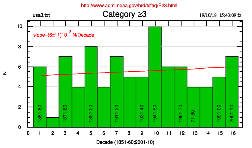
The list of cyclone landfalls in the USA, 1851-2018 can be found at the
AOML_HRD Site (NOAA, Hurricane Research Division).
From such a list I’ve extracted both usa.txt and usa3.txt (the first one concerns all the events, while the other concerns categories 3,4,5).
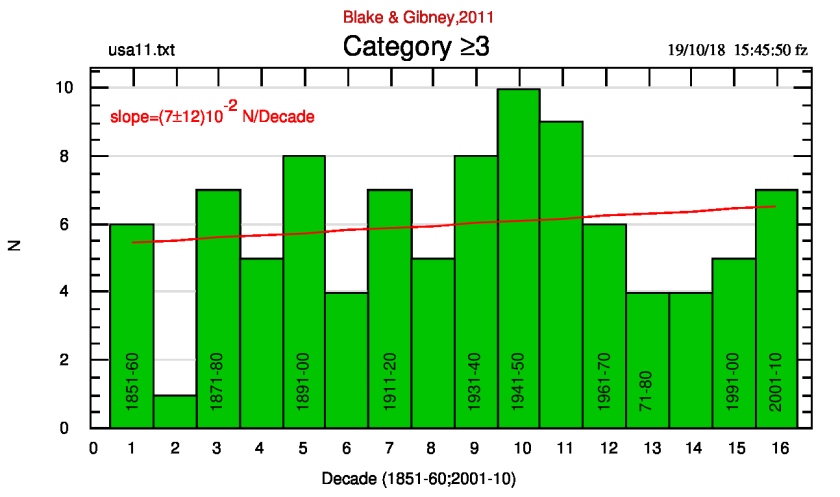
Another list exists, from Blake e Gibney,2011 where data are different, in spite of the same derivation; in practice the last list uses a different classification of the cyclones.
I don’t know what the correct list may be, so I’ll plot both lists but please note that the AOML_HRD is updated on July 31, 2018, while Blake & Gibney paper is a 2011 NOAA Technical Memorandum (NWS NHC-6).
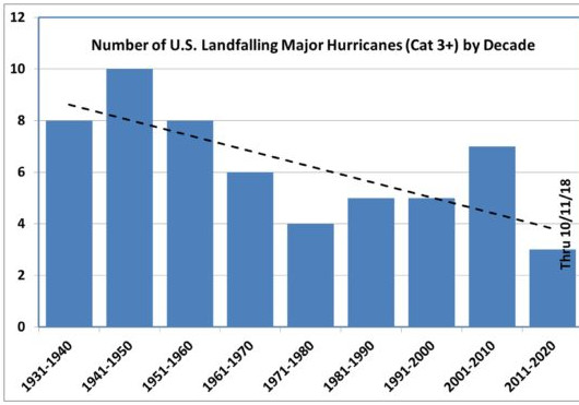
I regret so much to highlight that the following plot, published by Roy Spencer at his own site, is wrong and misleading because
1)
he did use as starting decade the 1931-40 one (and did not use the complete list from 1851-60), i.e. he applies an unnecessary cherry picking, and
he also did use the incomplete 17th decade (2011-20), data being available through 10/11/2018 (hurricane Michael) while the hurricane season ends in
November. And of course we lack 2019 and 2020 events.
The negative slope in figure 1 is an artifact depending on the cherry picking and the use of incomplete data.
Such a trial is ingenuous and not useful because, as plots 2) and 3) show, the correct slope is practically zero, giving a rise of 0.96 and 1.1 events in 160 years, with an almost 100% relative error, for plot 2) and 3) respectively. We don’t need a bad use of the available data; we can state, in perfect good faith, that the major hurricane landfall series doesn’t show any growth in the last century and half.
A reader of my post on ClimateMonitor informed us that Roy Spencer previously published the cyclone rainfalls within the whole (17) decades here. He also justify the choice to plot 9th through 17th decade (here presented along with the complete plot) as a comparison, in such a way: Why did I pick the 1930s as the starting point?
Because yesterday I presented U.S. Government data on the 36 most costly hurricanes in U.S. history, which have all occurred since the 1930s. Since the 1930s, hurricane damages have increased dramatically. But, as Roger Pielke, Jr. has documented, that’s due to a huge increase in vulnerable infrastructure in a more populous and more prosperous nation.
This may be a correct explanation for the cherry-picking used here in conjunction with the complete plot. Nevertheless, it cannot explain the lack of information associated to the last-published plot (1). It appears as an uncorrect and misleading choice of particular decades, in order to confirm his own ideas. Two rows of a newly repeated explanation would have been appreciated, while the actual choice appears to be a serious fault in Spencer credibility (and I’m very,very sorry to write that, really!). Also, the use of the 17th decade whose number of cyclones is totally unknown, is justified by: … if we assume the long-term average of 6 storms per decade continues for the remaining 2.5 hurricane seasons, the downward trend since the 1930s will still be a 50% reduction.but it appears unsupported and on the same run as the AWG supporters. Not necessary and misleading.
2)
3)
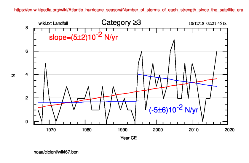
Someone correctly assumes that the use of USA landfall cyclones means a strong limit to the number of events. I agree with them and have used the data of all the cyclones, 1967 through 2017, selected in categories, available in Wikipedia and, given the starting date, relative to the satellite era.
The plot of the Cat.≥3 events follows. It can be noted the real positive
4)
slope which could bring to the idea of a growing number of extreme events in the last 50 years, but we note a break point near the years 1994-96 in the graph. So, two linear fits: before and after 1995, highlight two very different regimes of the series: before 1995 the cyclones number was constant on average; after the 1995 climate shift (in many European climatic series a climate shift in 1987 is also visible) the (relatively) large number of events tends to fall at a (0.05±0.06) events/yr rate.
The growing slope derived from the overall fit cannot be considered as a real one, given the two different behaviours of the data.
Franco Zavatti July 02, 2018 Last Updated: July 02, 2018
Published at ClimateMonitor #43923, March 8, 2017 (See also the Gianluca’s new comment with references).
On March 6, 2017 Gianluca, a reader of ClimateMonitor.it, in replying to a comment by giuliog02, quotes his phrase: “I don’t think it does change at scholars level, all of them being convinced it is AGW”
and writes:
I would like to highlight such a “mantra”, serially repeated by all the belivers in the mainstream narrative:
THE TOTAL CONSENSUS ON AGW.
My comment starts from the Antonello Pasini’s quote, some comments before the mine one, that linked the paper at “Climalteranti.it” (an italian site of “belivers” nbt (note by the translator)).
I reproduce here my comments appeared at Climalteranti.it in the aim to understand if in your opinion I did write only a large amount of trash.
I examined the papers referenced in the paper unanimously considered the basis of the 97% “rocky” consensus of the scientific world: CONSENSUS ON CONSENSUS BY COOK ET AL., 2016. (Environ. Res. Lett. 8, 024024, nbt).
After extracting (selecting) all people who presented some consensus for the anthropic contribution to the Global Warming (GW), hereafter called pro-AGW, I can derive (admittedly, in a very crude way) what follows:
BRAY and VON STORCH 2007: 497 pro-AGW vs 1069 selected (46.49%)
DORAN and ZIMMERMANN 2009: 2580 pro-AGW vs 10257 selected (25.15%)
ANDEREGG et al. 2010: 906 pro-AGW vs 1372 selected (66%)
BRAY 2010: 245 pro-AGW vs 2677 selected (9.15%)
ROSENBERG et al. 2010: 383 pro-AGW vs 986 selected (38.84%)
FARNSWORTH and LICHTER 2012: 411 pro-AGW vs 1000 (41.1%)
COOK et al. 2013: 10188 pro-AGW SU 29286 selected (34.79%)
STENHOUSE et al. 2014: 1821 pro-AGW vs 7197 selected (25.3%)
VERHEGGEN et al. 2014: 1227 pro-AGW vs 8000 selected (15.34%)
PEW RESEARCH CENTER 2015: 3261 pro-AGW vs 3748 selected (87%)
CARLTON et al. 2015: 633 pro-AGW vs 1868 selected (33.89%)
Not completely satisfied by the above analysis I further checked how many scholars have as main refererence the Climate Science field, among all those who replied to the polls, quoting themselves as pro-AGW, and derived the following:
BRAY and VON STORCH 2007: 63
DORAN and ZIMMERMANN 2009: 75
ANDEREGG et al., 2010: 194
BRAY 2010: 245
ROSENBERG et al. 2010: 178
FARNSWORTH and LICHTER 2012: datum not available, so I consider that all the authors here are connected to climate, i.e. 411.
COOK et al 2013: I note here a lot of smoke because Cook writes he did find more than 29,000 authors with papers in the field of Climatology (but we cannot know how many of them are actually active in the field) and to have send his questionnaire to 8,547 of them, receiving 1,189 answers, with only 746 declaring themselves as pro-AGW.
STENHOUSE et al. 2014: 115
VERHEGGEN et al. 2014: 555
PEW RESEARCH CENTER 2015: 123
CARLTON et al. 2015: 296
Again, we can obtain:
63+75+194+245+178+411+746+115+555+123+296=3001
So, it appears that our planet’s future depends on the opinions of 3,001 climatologists: no doubt that such a number is interesting (if the results does not depend on double, triple or more checking, given that the names could easily derive from the same lists and in the meanwhile -10 years- selected people did not change field of interest or become skeptic or also die).
In any case, are we sure that the above 3,000 individuals are representative of the ideas of all the worldwide climatologists whose number is, based on the Cook’s paper, about 30,000 (i.e. 10%)?
The CONSENSUS becomes more and more a NONSENSUS at my AVVISUS (a joke “latin” version for “in my opinion”, nbt).
Gianluca adds new information and corrections in a comment at http://www.climatemonitor.it/?p=43923:
I would like to add, solicited by the comments of some readers, that I reconsidered with more attention the papers and introduced some correction, also including the results of Gallup 1991:
GALLUP 1991: 264 pro-AGW vs 400 selected (66%)
BRAY and VON STORCH 2007: 497 pro-AGW vs 1069 selected (46.49%)
DORAN and ZIMMERMANN 2009: 2580 pro-AGW vs 10257 selected (25.15%)
ANDEREGG et al. 2010: 903 pro-AGW vs 1372 selected (65.81%)
BRAY 2010: 245 pro-AGW vs 2677 selected (9.15%)
ROSENBERG et al. 2010: 383 pro-AGW vs 986 selected (38.84%)
FARNSWORTH E LICHTER 2012: 410 pro-AGW vs 998 (41.08%)
COOK et al. 2013: 10188 pro-AGW SU 29286 selected (34.79%)
STENHOUSE et al. 2014: 1329 pro-AGW vs 7197 selected (18.47%)
VERHEGGEN et al. 2014: 1227 pro-AGW vs 8000 selected (15.34%)
PEW RESEARCH CENTER 2015: 3261 pro-AGW vs 3748 selected (87%)
CARLTON et al. 2015: 641 pro-AGW vs 1868 selected (34.3%)
Again adding:
264+497+2580+903+245+383+410+10188+1329+1227+3261+641= 21,928 pro-AGW
vs
400+1069+10257+1372+2677+986+998+29286+7197+8000+3748+1868= 67,858 selected
so, 21,928/67,858=32.31%
If I do account for only the pro-AGW climatologists:
GALLUP 1991: 65
BRAY and VON STORCH 2007: 46
DORAN and ZIMMERMANN 2009: 75
ANDEREGG et al. 2010: 194
BRAY 2010: 245
ROSENBERG at al. 2010: 178
FARNSWORTH and LICHTER 2012: 410
COOK et al. 2013: 746
STENHOUSE et al. 2014: 115
VERHEGGEN et al. 2014: 554
PEW RESEARCH CENTER 2015: 123
CARLTON et al 2015: 38
and, adding:
65+46+75+194+245+178+410+746+115+554+123+38=2,789 pro-AGW climatologists that, compared to the above 30,000 experts selected by Cook, represent about the 9.29%
Percent of pro-AGW people appears to be slightly less than the initial calculation, but probably my mistakes are present in some amount, so I’m confident with the kind collaboration of the readers.
Please note: the three papers at IOPSCIENCE (Carlton 2015, Cook 2013 and Cook 2016) cannot be accessed from the given link. Use the link to the DOI code. Bray 2010 requires an access to Academia.edu.